Table of Contents
A banner can impact the attendance of your event. People attend events for various reasons, and only a few will be interested in buying products or services. It is advisable to strive to engage and attend to their needs, and designing a well-crafted banner is a way of capturing their attention. The right advertising strategy is important to make a lasting impact and gain the most exposure.
Selecting an ideal banner for your event will have a positive impact and knowing the elements to include is the first- step to a quality banner. Read on for useful elements that a banner should capture.
Six Important Elements to Include in Your Banner
Invest in a Professionally Designed Banner
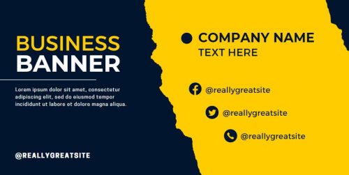 If the images on a banner have a low resolution, it can negatively impact your event and business. It will not only destroy the banner’s appearance but can also harm the reputation of your business. Invest in a professional banner design that is well printed rather than risk losing potential customers by using an unappealing banner.
Have Your Logo on Top of the Banner
Include information about your business, such as a logo, anywhere along the top of your banner so readers can easily identify the advertiser. It should be visible and straightforward to grasp without reading it entirely. It will give potential consumers a clear indication of the kind of goods or service you are marketing. Do not forget to utilize your pop-up banner layout to its fullest extent and make it vibrant and bold to overcome your competitors.
Avoid Sharing Too Much Information
 Avoid overwhelming readers with a lot of information; you can use brochures or flyers for more details. Provide the key information that seeks to address any potential issues they could have and provide a solution. Always finish up with a compelling call-to-action to pique interest and ensure the relevant details are brief. Losing a potential consumer before you have had a chance to deliver your message effectively is the most unfortunate thing.
Ensure Essential Information Is at the Top of the Banner
People read from the top downwards. Therefore, you should ensure the most important content is at the top. It is important to include your contact information at the bottom of the banner, but you also need to ensure that you capture the reader’s interest for a while for them to want to find out how to contact you.
Make Careful Color Selections
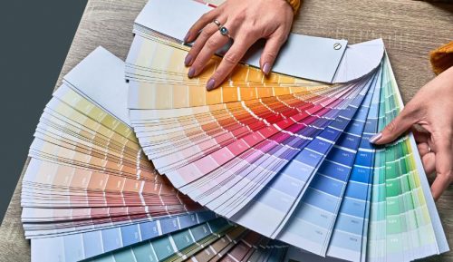 Utilizing your brand’s color scheme on your banner is crucial, ensuring the messaging is in line with your other promotional campaigns. Maximize your brand identity and raise your value for money to maintain a consistent experience across all channels.
Arrange Content from the Left Side to the Right
Humans tend to read from the left-hand side to right, and from top to bottom, so you must be careful about the content you include on the left of the retractable banner. Consider that you can include more details using business fliers or a brochure design.
An excellent banner will draw potential buyers to your upcoming trade exhibition and bring new business. To avoid confusion when consumers try to search you up digitally or check out a few of your prior marketing efforts, remember to maintain all of your offline and online advertising material consistent with your brand concept.
